DESIGN LEAD / VISUAL IDENTITY / MILIGRAMA DESIGN / 2020 - Fortaleza, Brazil
DESAFIO
-
A Fargo (antigamente Fanfargo), já era consolidada no mercado de sapatos e acessórios. Com estratégia e naming feitos pelo escritório Ana Couto (SP/RJ) e LAJE, fomos convidados a dar uma resposta visual alinhada com esse novo posicionamento.
CHALLENGE - Fargo (formerly Fanfargo), was already consolidated in the shoes and accessories market. With strategy and naming made by Ana Couto (SP / RJ) and LAJE, we provide a visual response in line with this new positioning.

SOLUÇÃO
-
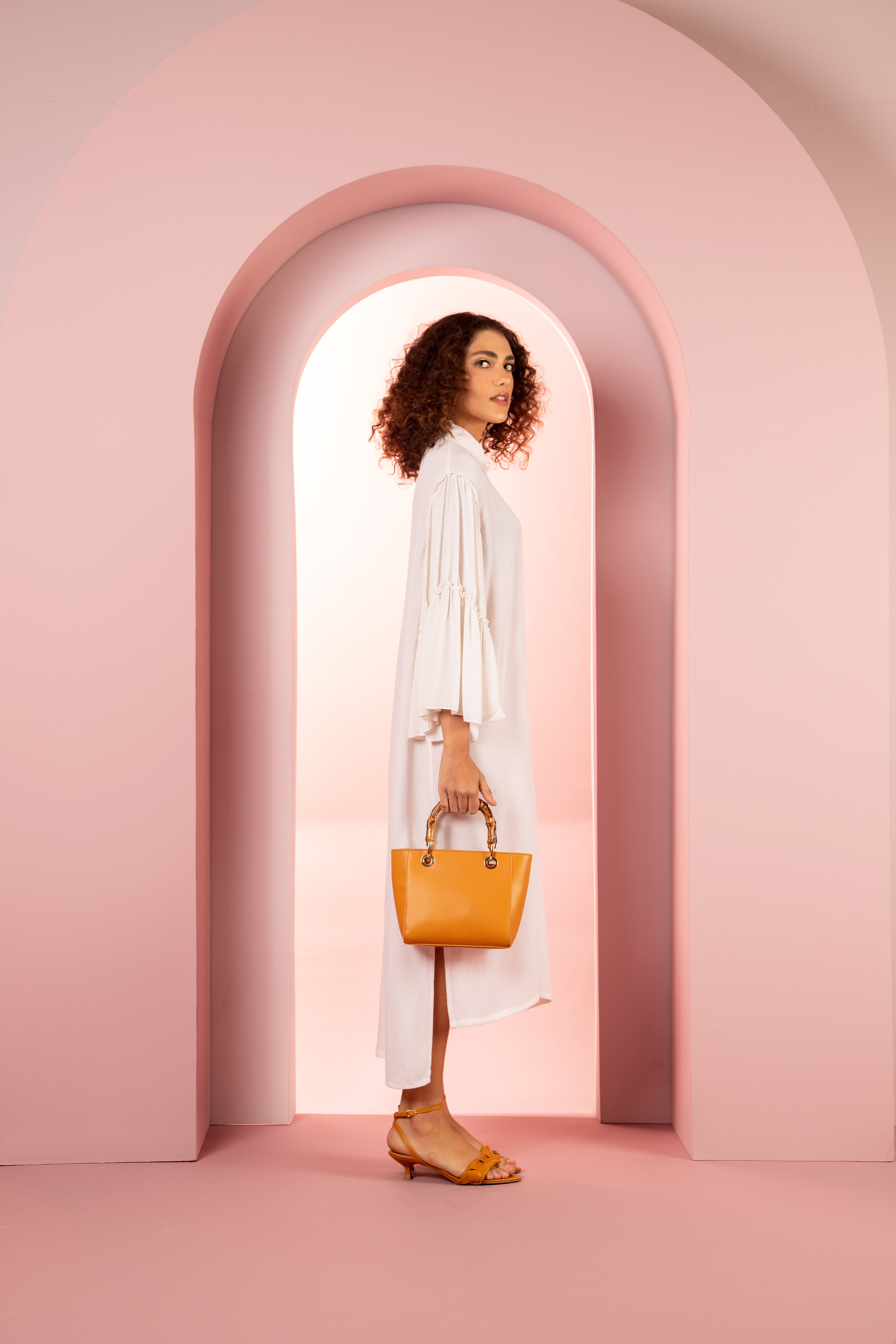
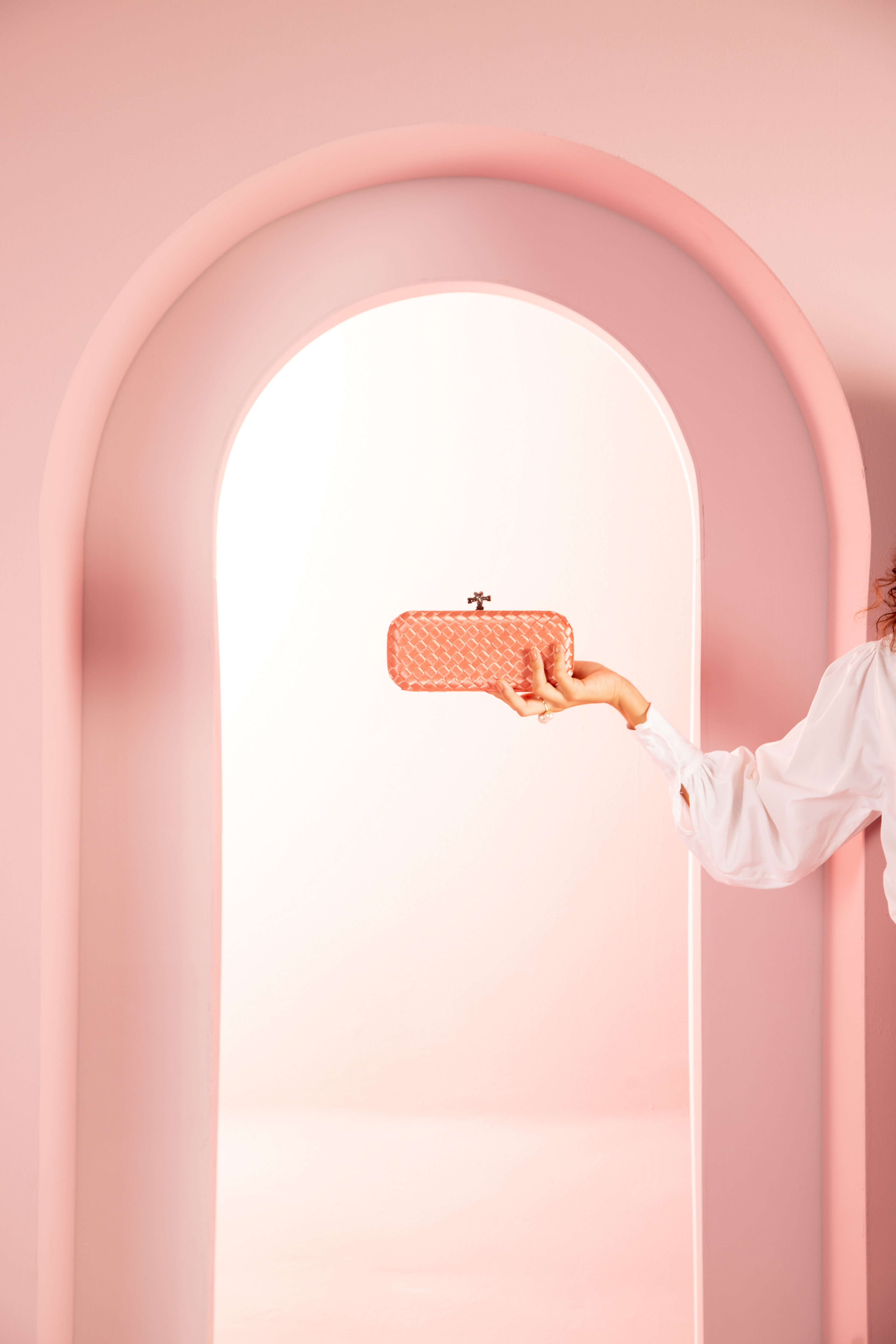
Depois de analisar e fazer uma curadoria dos pontos-chave da estratégia que norteariam a concepção visual, a solução foi definir a narrativa do elemento arco como principal forma de comunicar que a marca seria uma abertura de caminhos para ir mais longe, ir além. Uma porta de entrada para um novo momento. O elemento foi trabalhado desde os espaços negativos da tipografia, até os grafismos e direção fotográfica dos novos ensaios da marca.
Através de ferramentas e workshops com o setor de marketing, administrativo e funcionários, conseguimos diagnosticar também que a marca precisava ser mais calorosa e ser percebida com uma personalidade forte e que representasse um manifesto focado no protagonismo feminino e em se colocar como uma marca nordestina.
SOLLUTION - After analyzing and curating the key points of the strategy that would guide the visual design, the solution was to define the narrative of the arch element as the main way to communicate that the brand would be an opening of paths to go further, to go beyond. A gateway to a new moment. The element was worked from the negative spaces of typography, to the graphics and photographic direction of the brand's new essays.Through tools and workshops with the marketing, administrative and employees sectors, we were also able to diagnose that the brand needed to be warmer and be perceived with a strong personality and that represented a manifesto focused on female protagonism and on positioning itself as a Northeastern brand.

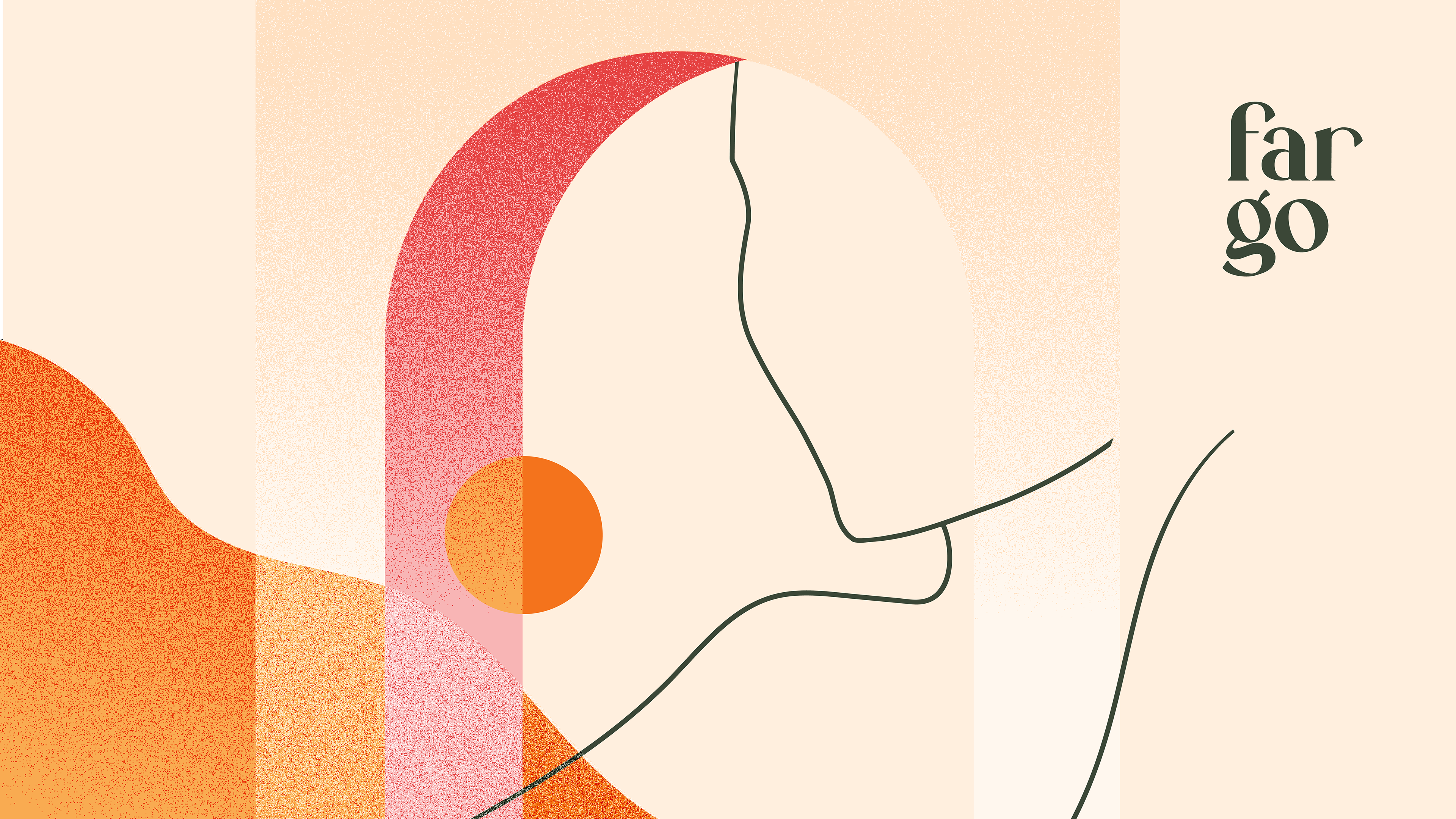
Foi então que surgiu a ideia de convidar uma ilustradora local (Lorena Araújo) para desenvolver elementos e grafismos próprios da marca que se relacionassem com a narrativa.
Dirigi a concepção das ilustrações com foco em representar figuras femininas em um contexto abstrato, onde as silhuetas também seriam parte da paisagem, e a ideia do solar/texturas arenosas aproximando a percepção do regional. Os elementos deveriam funcionar também isoladamente, para que o setor de marketing - e quem utilizasse o sistema de identidade - pudesse criar suas próprias composições. Por isso a estética também precisava ser essencialmente geométrica e minimalista, ainda que com a referência a traços manuais.
It was then that the idea arose of inviting a local illustrator (Lorena Araújo) to develop the brand's own elements and graphics that would relate to the narrative.I directed the conception of the illustrations with a focus on representing female figures in an abstract context, where the silhouettes would also be part of the landscape, and the idea of the solar/sandy textures bringing the perception of the regional closer. The elements should also work in isolation, so that the marketing sector - and whoever used the identity system - could create their own compositions. Therefore, the aesthetics also needed to be essentially geometric and minimalist, albeit with reference to manual strokes.